Lesson Topics Discussion Quiz: Class Homework |
Example1 |
Title: Graphs |
Grade Lesson s6-l7 |
Explanation: The best way to understand SAT-4 is by looking at some examples. Take turns and read each example for easy understanding. |
Examples
Topics → Definition Example1 Example2 Example3
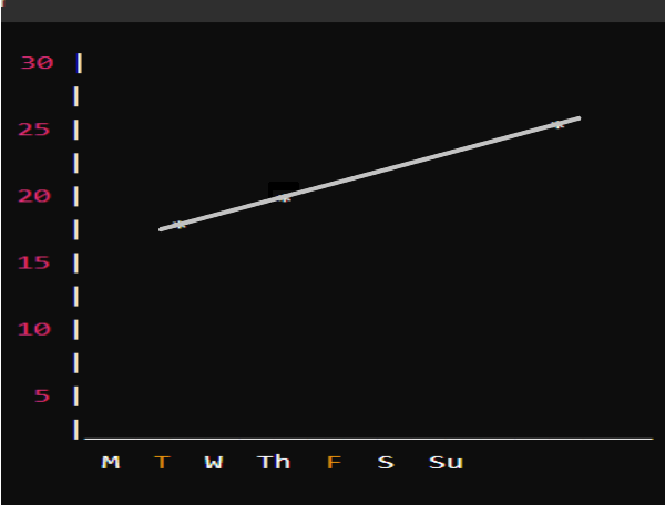
The data below shows the temperature in degrees Celsius at noon for a week.
Create a line graph to represent this data.

Step: 1 |
|
Draw the x-axis and y-axis. Label the x-axis with the days of the week and the y-axis with the temperature in degrees Celsius Plot the temperature for each day |
|
Explanation: Here, we draw the x-axis and y-axis assign the values for each day in the graph, and connect them to form a straight line. |
|
Step: 2 |
|
|
|
Explanation: Here, we draw the graph that temperature is increasing exponentially. |
|
Copyright © 2020-2024 saibook.us Contact: info@saibook.org Version: 4.0 Built: 04-Apr-2025 12:00PM EST