Lesson Example Discussion Quiz: Class Homework |
Step-1 |
Title: Pictographs, Frequent Tables, Histograms |
Grade: 1400-a Lesson: S4-L8 |
Explanation: Hello Students, time to practice and review the steps for the problem. |
Lesson Steps
| Step | Type | Explanation | Answer |
|---|---|---|---|
1 |
Problem |
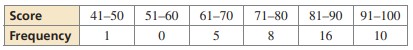
The frequency table shows the chemistry exam scores for a class. Display the data in a histogram. Describe the distribution.
|
|
2 |
Step |
Histogram: |
|
3 |
Step |
Description of Distribution: |
|
4 |
Step |
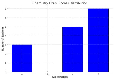
This description matches option 2’s indication that the distribution is correct. Let’s now plot the histogram for better visualization.
|
|
5 |
Step |
The histogram above displays the distribution of the chemistry exam scores. From the histogram, we can describe the distribution as follows: |
|
6 |
Step |
Therefore, the description confirms that the histogram data is represented accurately by option 2. |
|
7 |
Choice.A |
This indicates that 3 students scored within the first score range |
3 |
8 |
Choice.B |
This is particularly important because it highlights the fact that there are no students in the second score range, which is a key feature of the distribution and can significantly affect the shape and interpretation of the histogram. This absence is crucial in describing the distribution, thus making option 2 (0 students) the correct answer for describing the data distribution as shown |
0 |
9 |
Choice.C |
This means that there are 5 students in one of the score ranges. In the histogram, this corresponds to the third score range |
5 |
10 |
Choice.D |
There are 7 students in the fourth score range, so the bar corresponding to "4" reaches up to 7 on the Y-axis |
7 |
11 |
Answer |
Option |
B |
12 |
Sumup |
Can you summarize what you’ve understood in the above steps? |
|
Copyright © 2020-2022 saibook.us Contact: info@saibook.us Version: 1.5 Built: 18-June-2024 09:20AM EST