Lesson Example Discussion Quiz: Class Homework |
Lesson |
Title: Pictographs, Frequent Tables, Histograms |
Grade: 1400-a Lesson: S4-L8 |
Explanation: Hello students, let us learn a new topic in SAT-2 today with definitions, concepts, examples, and worksheets included. |
Lesson:
Definition: Pictographs |
|
A pictograph is a way to represent the data using images or symbols. It represents the frequency of the data using images. Each image represents the frequency of the data. |

. |
Explanation: The pictograph shows the profits earned by a company which shows the profits earned by a company over four years. The years listed are 2020, 2021, 2022, and 2023. |
|
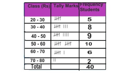
Definition: Frequent Tables |
|
A frequency table is simply a "t-chart" or two-column table that outlines the various possible outcomes and the associated frequencies observed in a sample. |
. |
Explanation: The frequent table shows the students in each income class. The first row shows the income class (20-30 rupees, 30-40 rupees, etc.). The second row shows tally marks for each income class. The third row shows the frequency. |
|
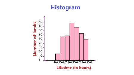
Definition: Histograms |
|
A histogram is a graph that shows the frequency of numerical data using rectangles. The height of a rectangle (the vertical axis) represents the distribution frequency of a variable (the amount, or how often that variable appears). |
. |
Explanation: The diagram you sent is a histogram titled "Number of lamps". The x-axis of the diagram shows the lifetime of the lamps in hours. The y-axis shows the number of lamps. |
|
Copyright © 2020-2022 saibook.us Contact: info@saibook.us Version: 1.5 Built: 18-June-2024 09:20AM EST