Lesson Example Discussion Quiz: Class Homework |
Example |
Title: Venn Diagrams, Circle graphs, Bar and Line Graphs |
Grade: 1300-a Lesson: S4-L7 |
Explanation: The best way to understand SAT-2 is by looking at some examples. Take turns and read each example for easy understanding. |
Examples:
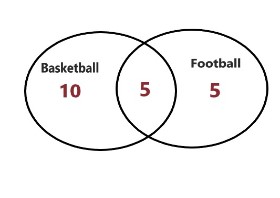
In a group of 30 students:
a) 15 students play football
b) 10 students play basketball
c) 5 students play both football and basketball
We need to draw a Venn diagram and find out how many students play only football, only basketball, and neither sport.
Step 1a
|
|
Draw two overlapping circles |
|
Explanation: Here, we draw the two overlapping circles. One circle is Football and the other circle is Basketball. And overlapping area is 5. |
|
Step 1b
|
|
The number of students who play only football in the football circle but outside the overlapping area: 15 - 5 = 10. |
|
Explanation: Here, 10 students play football, 5 students play football and basketball, 5 students play basketball, and 10 students play neither sport. |
|
Step 1c
|
|
|
|
Explanation: Here, we draw the all values in the Venn diagram. |
|
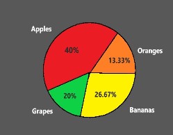
A class of 30 students was surveyed about their favorite fruit. The results are as follows:
Apples: 12 students
Bananas: 8 students
Grapes: 6 students
Oranges: 4 students
We need to create a circle graph to represent this data.
Step 2a
|
|
Total students = 30 Draw a circle |
|
Explanation: Here, we calculate the percentage of each fruit and draw a circle to divide the values. |
|
Step 2b
|
|
|
|
Explanation:
Here, we draw the graph |
|
The data below shows the temperature in degrees Celsius at noon for a week.
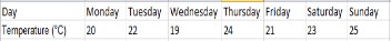
Create a line graph to represent this data.
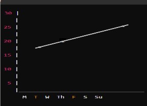
Step 3a
|
|
Draw the x-axis and y-axis. Label the x-axis with the days of the week and the y-axis with the temperature in degrees Celsius Plot the temperature for each day Connect the points with straight lines. |
|
Explanation: Here, we draw the x-axis and y-axis assign the values for each day in the graph, and connect them to form a straight line. |
|
Step 3b
|
|
|
|
Explanation: Here, we draw the graph that temperature is increasing exponentially. |
|
Copyright © 2020-2022 saibook.us Contact: info@saibook.us Version: 1.5 Built: 18-June-2024 09:20AM EST