Lesson Topics Discussion Quiz: Class Homework |
Quiz At Home |
Title: Two-Variable Data |
Grade Lesson s6-l2 |
Explanation: Hello Students, time to practice and review. Let us take next 10-15 minutes to solve the ten problems using the Quiz Sheet. Then submit the quiz to get the score. This is a good exercise to check your understanding of the concepts. |
Quiz: at Home
| Id | Name | Note |
|---|---|---|
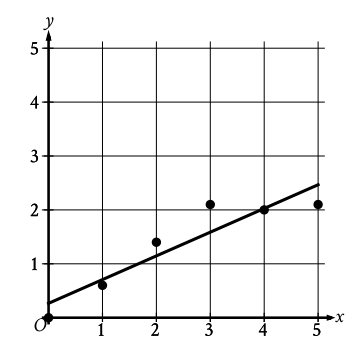
1 |
The scatterplot illustrates the relationship between x and y, with a line of best fit included. What is the approximate slope of the line of best fit?
|
A) -0.44 B) 2.27 C) 0.5 D) -2.27 |
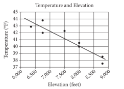
2 |
The scatterplot above illustrates the relationship between high temperatures on a specific day and the elevations of eight different locations within the Lake Tahoe Basin. A line of best fit for the data is also displayed. Which of the following statements best describes the association between the elevation and the temperature at these locations?
|
A) Negative association between elevation and temperature B) As the elevation increases, the temperature tends to increase C) As the elevation decreases, the temperature tends to decrease D) There is no association between the elevation and the temperature |
3 |
Which equation best represents the linear model for the scatterplot data?
|
A) y = 2x + 11 B) y = 1.9x + 10.1 C) y = 1.9x - 10.1 D) y = - 2x + 11 |
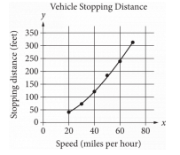
4 |
A study was conducted to determine the stopping distance of a new car when traveling at various speeds. The research was performed on a dry road with optimal surface conditions. The results are presented below, along with a graph of a quadratic function that models the data. Based on this model, what is the best estimate for the stopping distance, in feet, if the vehicle is traveling at 55 miles per hour?
|
A) 250 B) 200 C) 30 D) 25 |
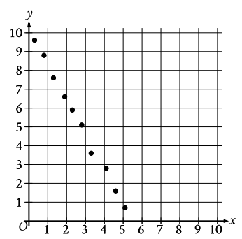
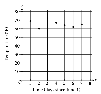
5 |
The scatterplot displays the temperature (y, in °F) recorded by a meteorologist at various times (x, in days since June 1). During which of the following periods did the greatest increase in recorded temperature occur?
|
A) From x = 2 to x = 3 B) From x = 1 to x = 2 C) From x = 6 to x = 7 D) From x = 5 to x = 6 |
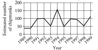
6 |
The line graph illustrates the estimated number of chipmunks in a state park on April 1 of each year from 1989 to 1999. Based on the graph, in which year was the estimated number of chipmunks in the state park at its highest?
|
A) 1,989 B) 1,994 C) 1,995 D) 1,998 |
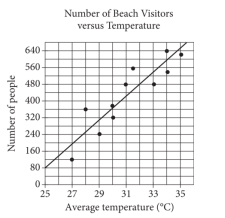
7 |
Each dot in the scatterplot above represents the temperature and the number of people who visited a beach in Lagos, Nigeria, on eleven different days. The line of best fit for the data is also displayed. According to this line of best fit, what is the predicted number of people, rounded to the nearest ten, who would visit the beach on a day with an average temperature of 31°C?
|
A) 550 B) 230 C) 480 D) 200 |
8 |
A scatterplot illustrates the relationship between the age of a smartphone (x-axis) and its price (y-axis). If the line of best fit intersects the point (4, 600), what is the price of a four-year-old smartphone according to this line of best fit? |
A) $1,000 B) $800 C) $400 D) $600 |
9 |
The equation y = 5x + 20 represents the relationship between the number of hours spent studying per week (x) and the total calories burned (y). Based on this equation, how many calories does a student burn per hour of studying? |
A) 5 calories per hour B) 32 calories per hour C) 40 calories per hour D) 10 calories per hour |
10 |
Create a scatterplot using the following data: Number of hours spent practicing basketball (x-axis): 3, 6, 9, 12, and 15 hours. Number of points scored in a game (y-axis): 10, 20, 30, 40, and 50 points. What kind of relationship does the scatterplot suggest? |
A) Negative correlation B) Positive linear relationship C) No correlation D) 0 |
Copyright © 2020-2024 saibook.us Contact: info@saibook.org Version: 4.0 Built: 31-Mar-2025 12:00PM EST