Lesson Example Discussion Quiz: Class Homework |
Step-1 |
Title: Venn Diagrams, Circle graphs, Bar and Line Graphs |
Grade: 1400-a Lesson: S4-L7 |
Explanation: Hello Students, time to practice and review the steps for the problem. |
Lesson Steps
| Step | Type | Explanation | Answer |
|---|---|---|---|
1 |
Problem |
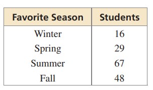
The table shows the results of a survey. Display the data in a circle graph.
|
|
2 |
Step |
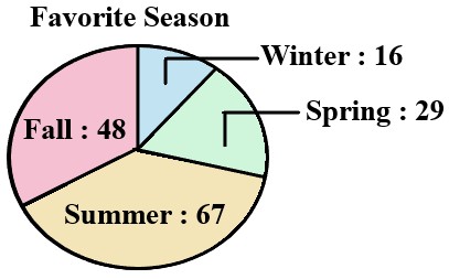
The circle graph B matches the data in the table exactly. Here is a breakdown of the data it shows: → Fall: 48% |
|
3 |
Step |
Therefore, Fall has the highest percentage (48%), it would take up the largest portion of the circle graph. The circle graph B matches this description exactly. |
|
4 |
Choice.A |
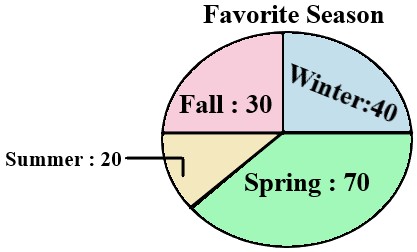
This circle graph incorrectly depicts the data Spring Slice: Spring appears larger than Winter, which contradicts the data (Winter has 16% and Spring has 29%) |
|
5 |
Choice.B |
This circle graph (the one you mentioned as correct) accurately represents the data Other Slices: Winter, Spring, and Summer slices are all smaller than Fall, and their relative sizes somewhat correspond to their data percentages (Winter smallest, then Spring, then Summer) |
|
6 |
Choice.C |
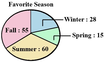
This circle graph also misrepresents the data Spring and Summer Slices: Spring and Summer slices are larger than Fall, although Summer has a lower percentage (20%) than Spring (29%) |
|
7 |
Choice.D |
Similar to option C, this graph also inaccurately portrays the data Spring Slice: The largest slice is Spring, which is incorrect according to the data |
|
8 |
Answer |
Option |
B |
9 |
Sumup |
Can you summarize what you’ve understood in the above steps? |
|
Copyright © 2020-2022 saibook.us Contact: info@saibook.us Version: 1.5 Built: 18-June-2024 09:20AM EST