Lesson Topics Discussion Quiz: Class Homework |
Example1 |
Title: Statistics |
Grade Lesson s4-p2 |
Explanation: The best way to understand SAT-4 is by looking at some examples. Take turns and read each example for easy understanding. |
Examples
Topics → Definition Example1 Example2
The following table represents the exam scores (out of 100) of 30 students in a class:

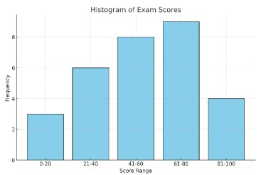
Create a histogram to represent the frequency distribution of the exam scores.
Step: 1 |
|
X - axis = Score range, Y - axis = Frequency Draw bars for each score range, with the height of each bar corresponding to the frequency. |
|
Explanation: |
|
Here, we draw the x-axis, and y-axis and draw bars to represent scores based on their frequency. |
|
Step: 2 |
|
|
|
Explanation: |
|
Therefore, the histogram provides a visual representation of the distribution of scores, making it easy to see which score ranges are most and least common in the class. |
|
Copyright © 2020-2024 saibook.us Contact: info@saibook.org Version: 4.0 Built: 07-Nov-2025 12:00PM EST